
"Mythic intelligence. Victorian navigational. Older than wellness."
Three swappable themes (dark, light, warm) share one set of semantic tokens. Playfair Display italic, always italic, for headings. Chivo for body and UI. Reality Stone for the wordmark only. One bright accent per theme, generous whitespace, soft elevation. starboardmanifest.com
Raw palette below. In components, always use role tokens (--bg-color, --accent-color, etc.), which resolve correctly for every theme.
Navy family
Cream & parchment
Accent: lime / olive / sage
Earth & terracotta
Semantic status · cross-theme
Current theme tokens
Color philosophy
A flat #04041C border on cream reads as too heavy. Tint instead: --card-border = 10–25% of text-color, --card-border-highlighted = 18–50%. Always 1px width.
Card shadows tint toward --text-color, never pure black. Modal is always 0 25px 50px -12px rgba(0,0,0,.5) regardless of theme.
Blur (backdrop-filter: blur(10px)) is for nav and overlays only. Cards are opaque. --card-bg-glass is a solid color despite the legacy name. Modal backdrop is solid rgba(0,0,0,.8), never blurred.
No gradient buttons. No bluish-purple gradient backgrounds. No generic vibe gradients. Buttons use flat solid accent fills only.
Moon page
The Moon (lunar phases) page uses atmospheric overlays (star tile patterns, particles, ink texture) but stays within the existing theme palette. Do not introduce jewel tones, amethyst, or gold accents. The moon orb itself is CSS-painted. No canvas script in the design system. Use a placeholder SVG for static mocks.
Three brand fonts only. Playfair Display italic, always italic, never upright, for all headings and display. Letter-spacing 0.01–0.05em. Chivo for body and UI, weight 400 body / 600 eyebrows / 700 bold labels. Reality Stone for the wordmark lockup only. No Google Fonts dependency. All loaded from local TTF files.
Display · Playfair Display Italic
Type scale (desktop ≥ 768px)
Eyebrows & labels · Chivo 700 uppercase
13px · lg eyebrow
10px · section label
8.5px · micro
accent label
tooltip
Reality Stone · wordmark
Logo wordmark font only. Use var(--font-family-reality) for typographic lockups, deck titles, badge text. Not available via Google Fonts. Loaded from starboard-design-system/fonts/Reality_Stone.ttf.
User-choice fonts: vision board surfaces only
These are fonts Sailors pick to style their own board copy. They are not brand fonts and must not appear on any Starboard-authored surface (marketing, onboarding, emails, slides).
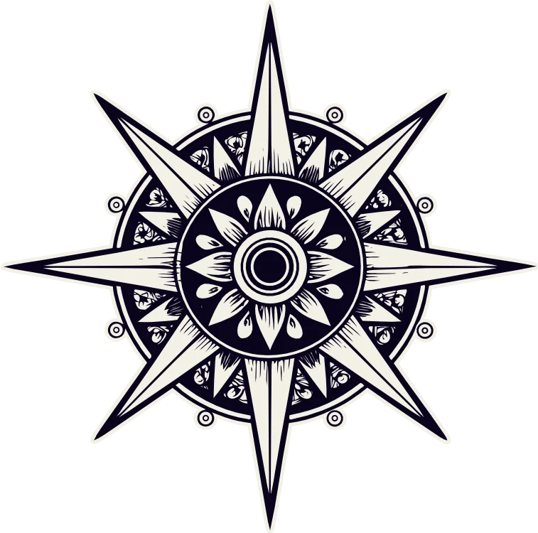
useruseruseruserSix-pointed compass-rose star with ornamental border. Three themed palettes, each with five variants. Use the green version wherever the background could be either light or dark (email, HTML embeds).
Dark: cream on navy


Light: black on white


Warm: brown on cream


Green: for email & dual-mode contexts
Use when the background could be either light or dark: email HTML, embedded iframes, App Store screenshots. Reads on all three themes.
Variants: primary, secondary, tertiary, ghost, danger. Sizes: sm / default / lg. Modifiers: pill, icon. No gradient fills, solid accent bg only.
Used for Templates / Catalog, Profile / Billing / Settings, and theme switching. Active fills with button-bg; container is a 9999px pill.
Subtle resting shadow, lift on hover. Surface is --card-bg-glass per theme. Highlighted variant uses --card-border-highlighted.
Career board
Roles, screenshots, and quotes that point toward the next chapter.
12 imagesHealth & rest
A daily reminder lives here. Soft, consistent, the inner compass.
HighlightedMy Sovereignty
A living altar to self-sovereignty and wealth.
7 imagesAccent ring on focus. Consistent 8px radius. OTP style for passcode entry.
Linear marquee at 28s. Edge-fade mask. Logomark pattern as separator. Background is --ticker-bg, text is --ticker-text.
Fixed 64px + safe-area in production. Hidden at md and up. Active tab fills with 12% accent tint. Lucide icons at stroke-width 2.
Annual plan (highlighted) is the recommended tier. Price uses Playfair italic for character. £23/year positioned as "Keep your compass true."
Starboard runs three distinct illustration registers. They are not interchangeable. Pick one per surface and stay there. Don't mix registers in one composition. Inked decoration with inked decoration. Board art with board art. Oracle with oracle.
| # | Register | Lives in | Use for | Treatment |
|---|---|---|---|---|
| 01 | Detailed inked | assets/elements/dark/ | App chrome, marketing decoration, parallax hero ornaments | Cream on navy. Slightly transparent or full opacity depending on context. Can sit behind content or stand as decoration. Never the focal point. |
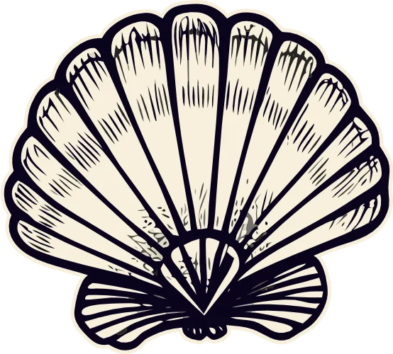
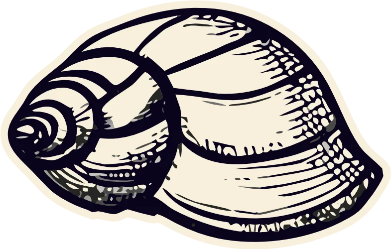
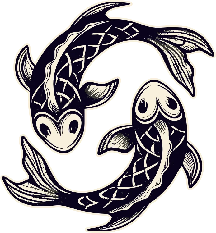
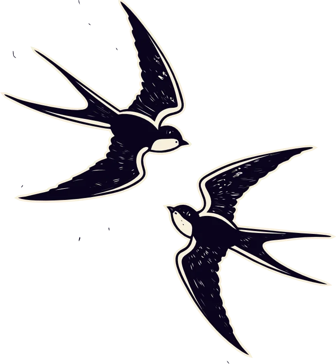
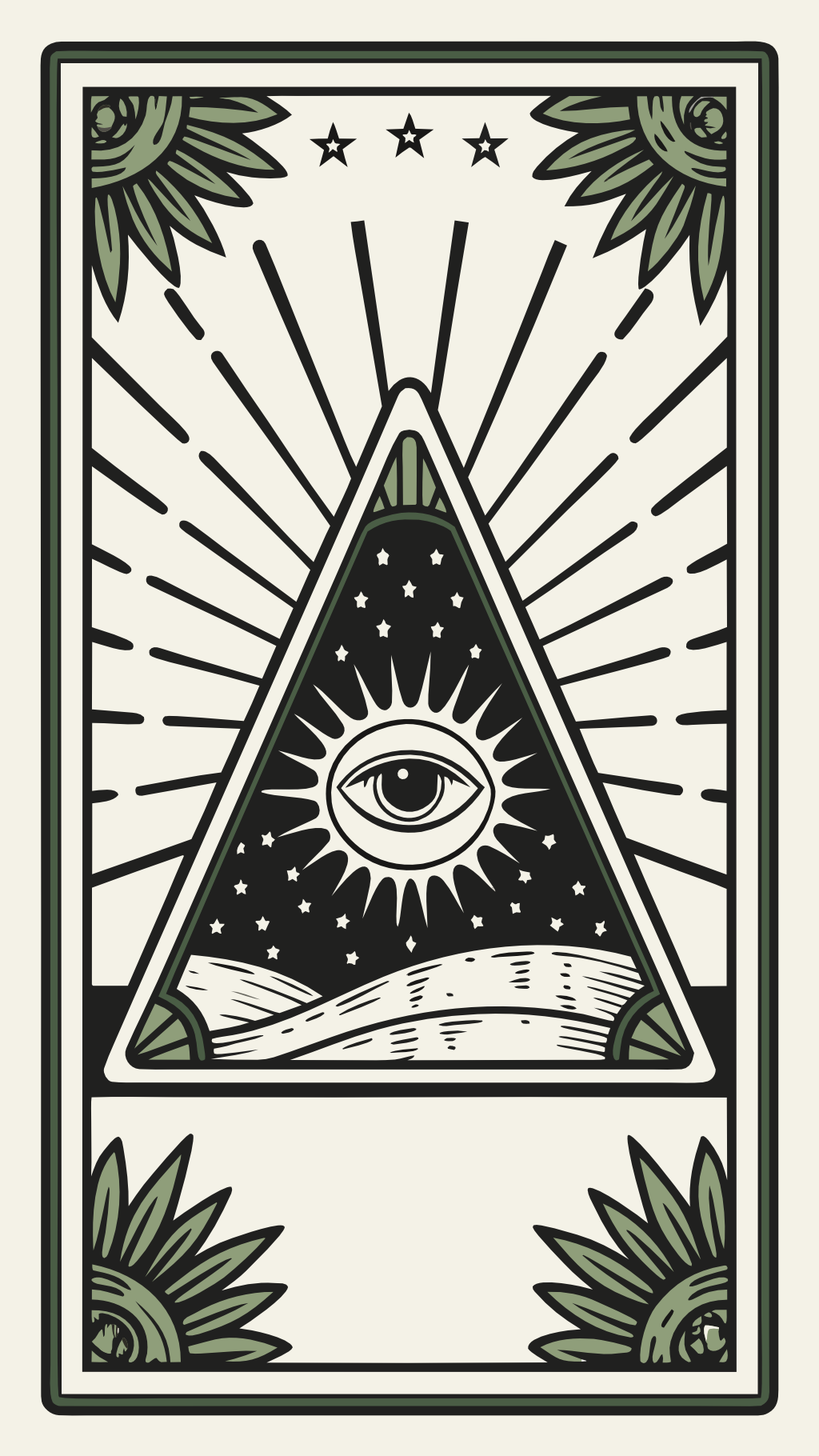
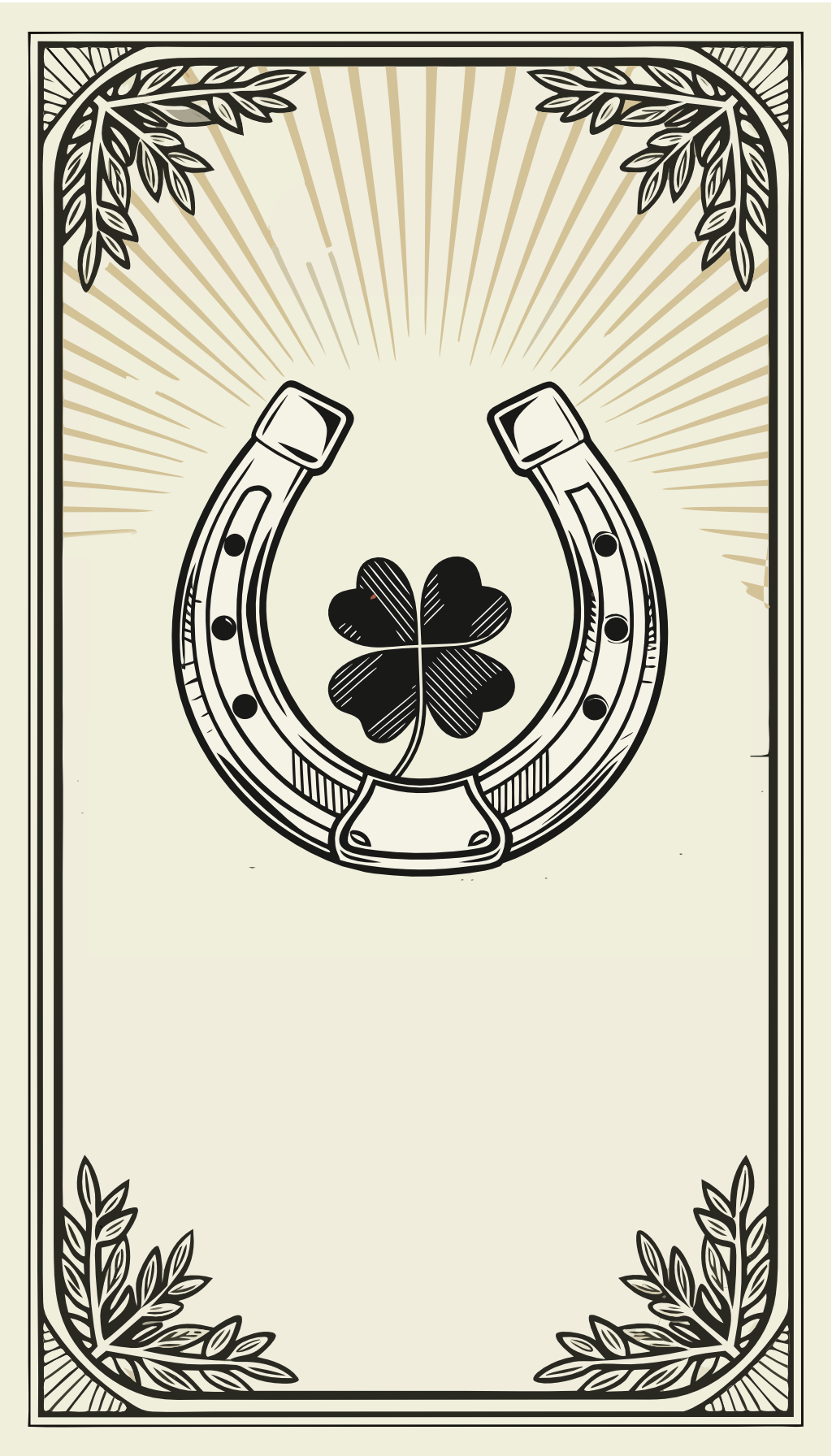
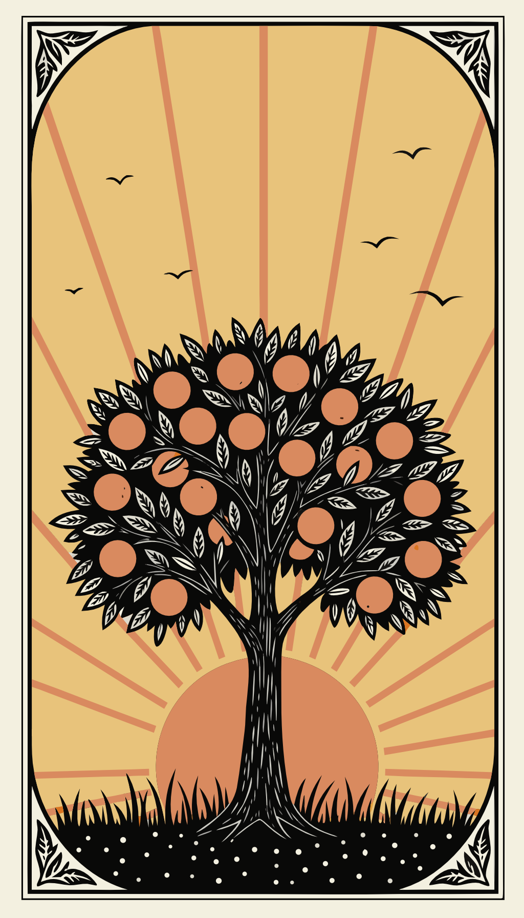
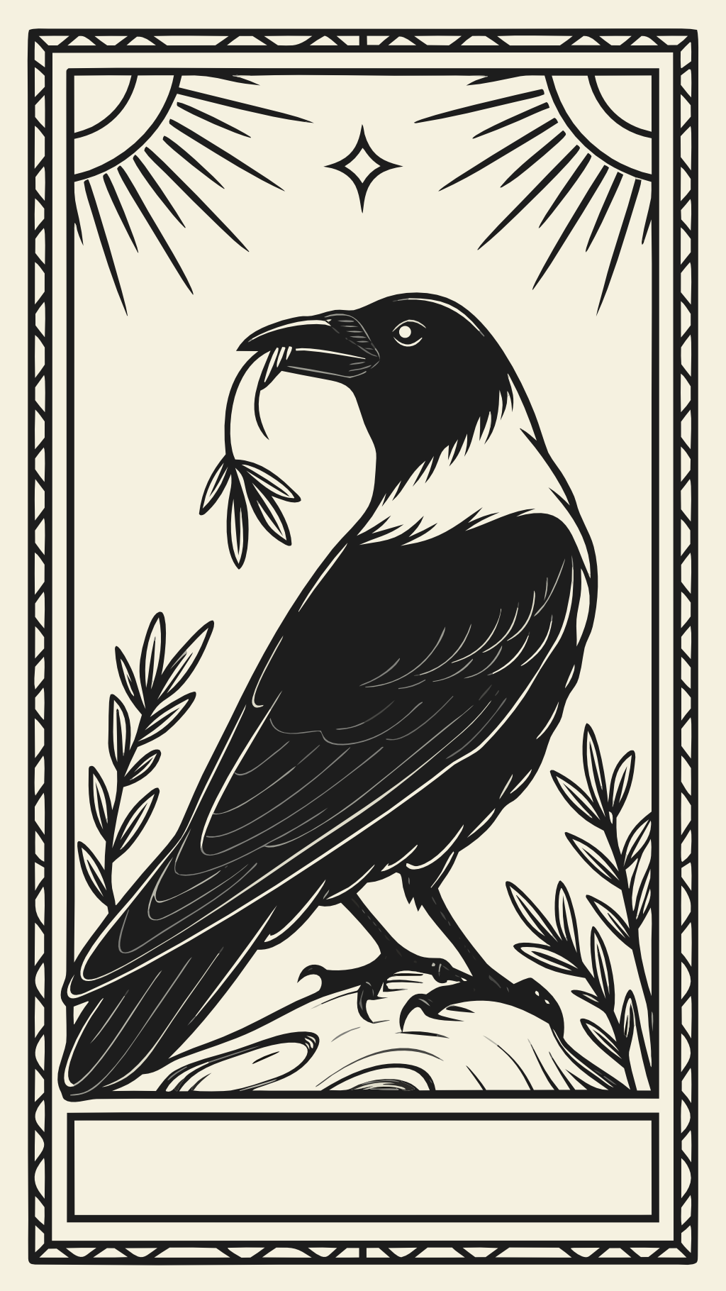
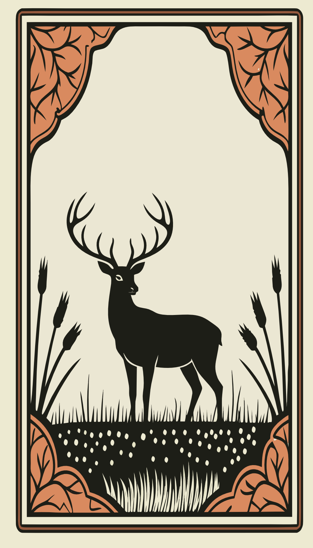
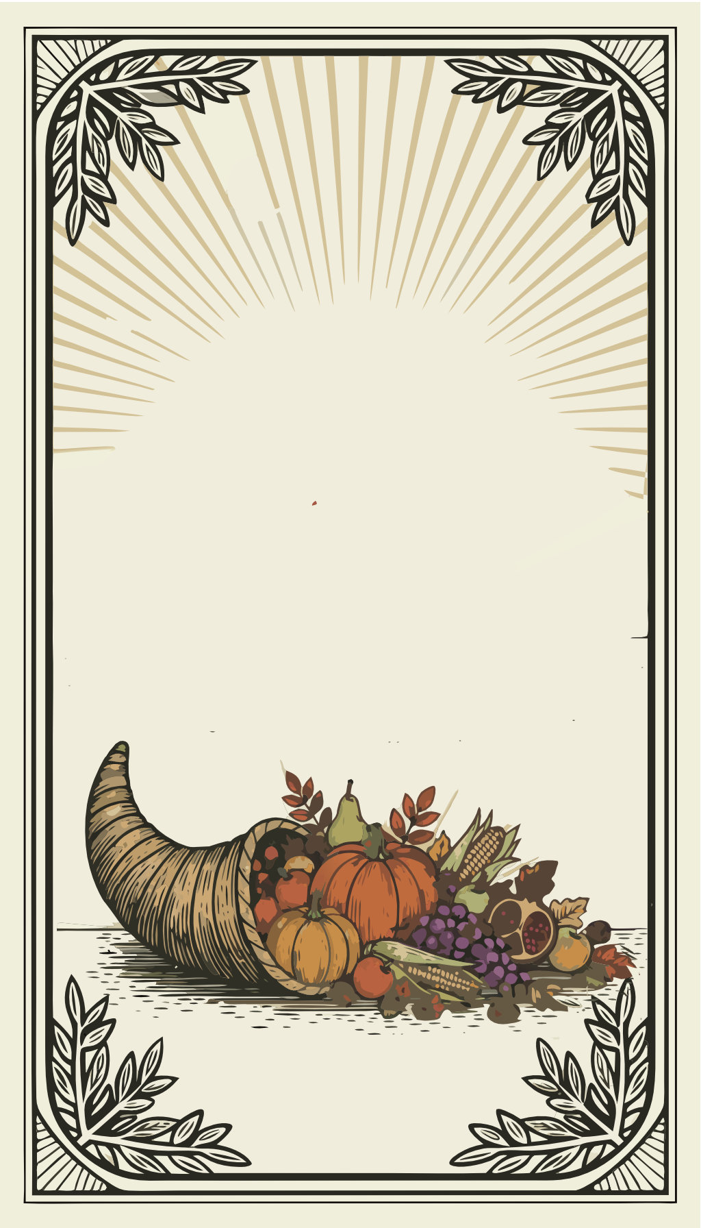
| 02 | Pared-back board art | assets/board-art/ | Vision boards, App Store hero, Pinterest pins, print, billboards | Bold black-and-cream silhouettes in art-nouveau frames. Standalone. Full opacity, never behind text. |
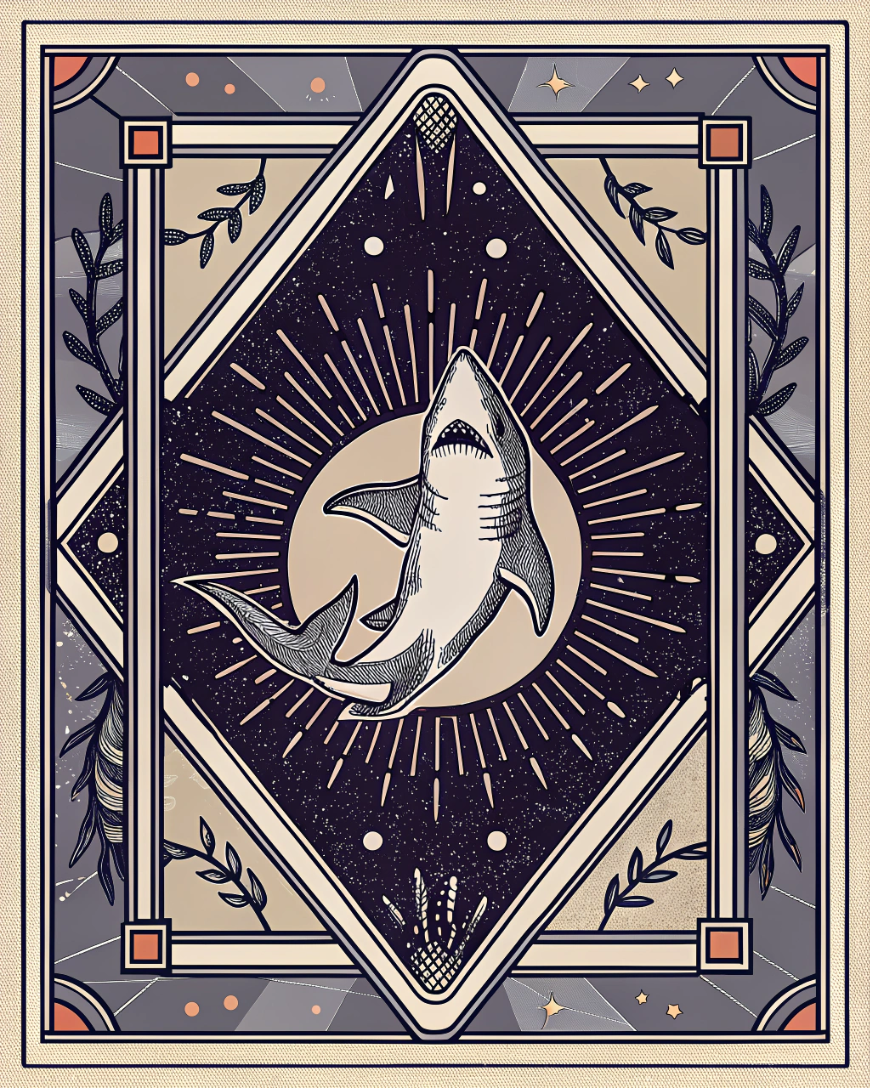
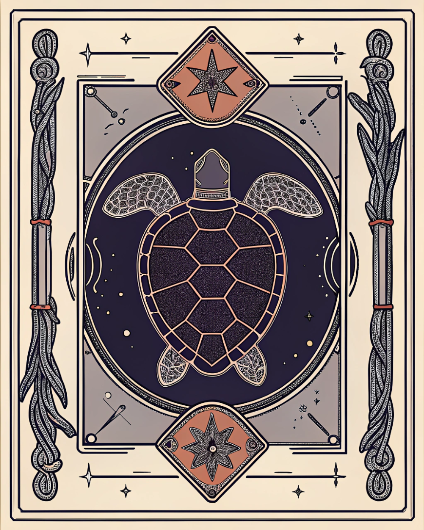
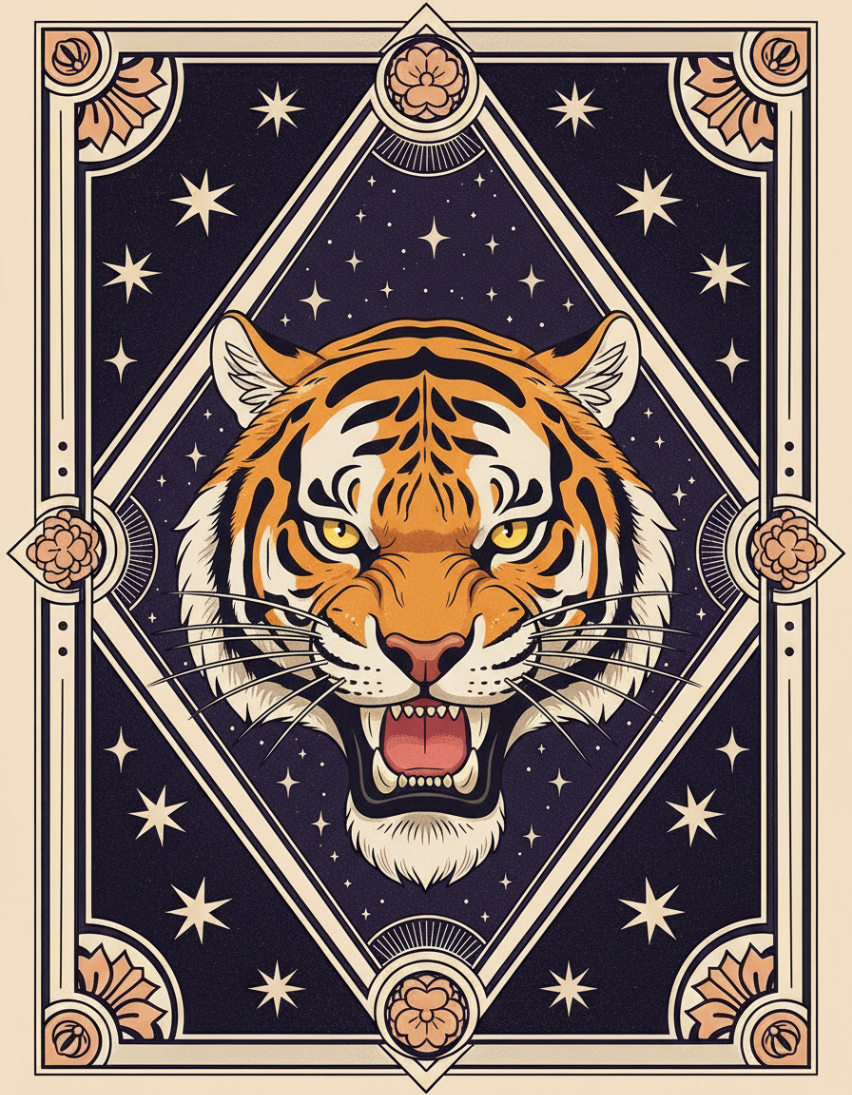
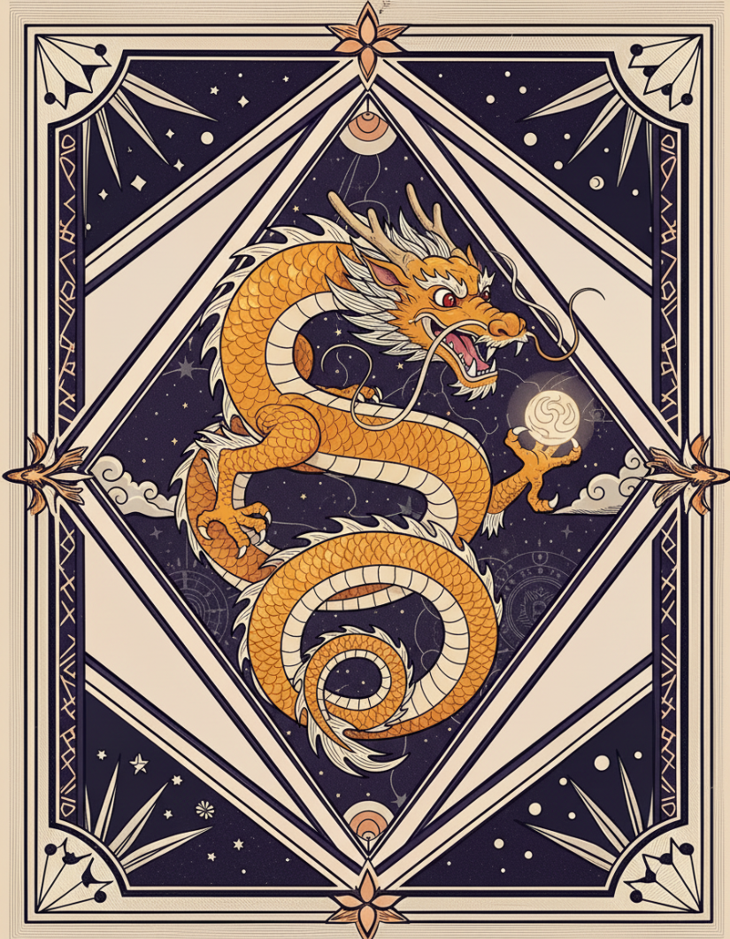
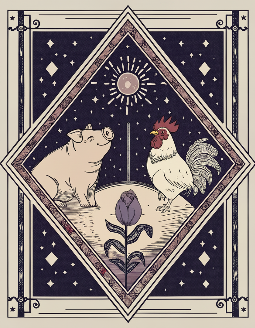
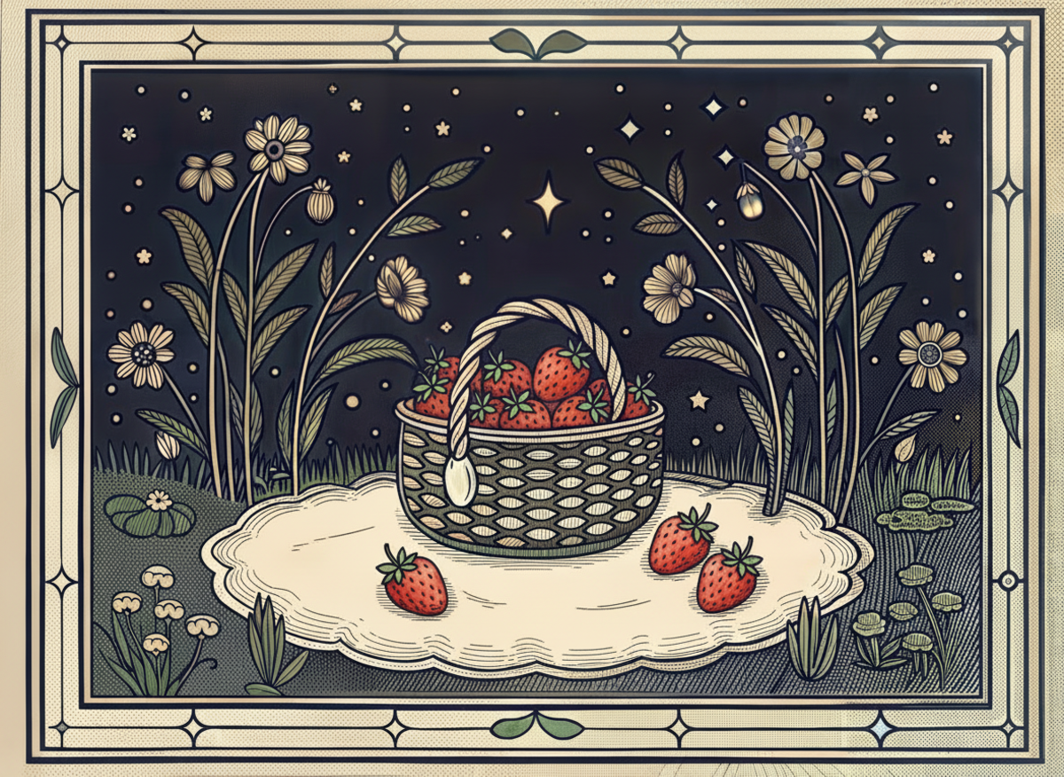
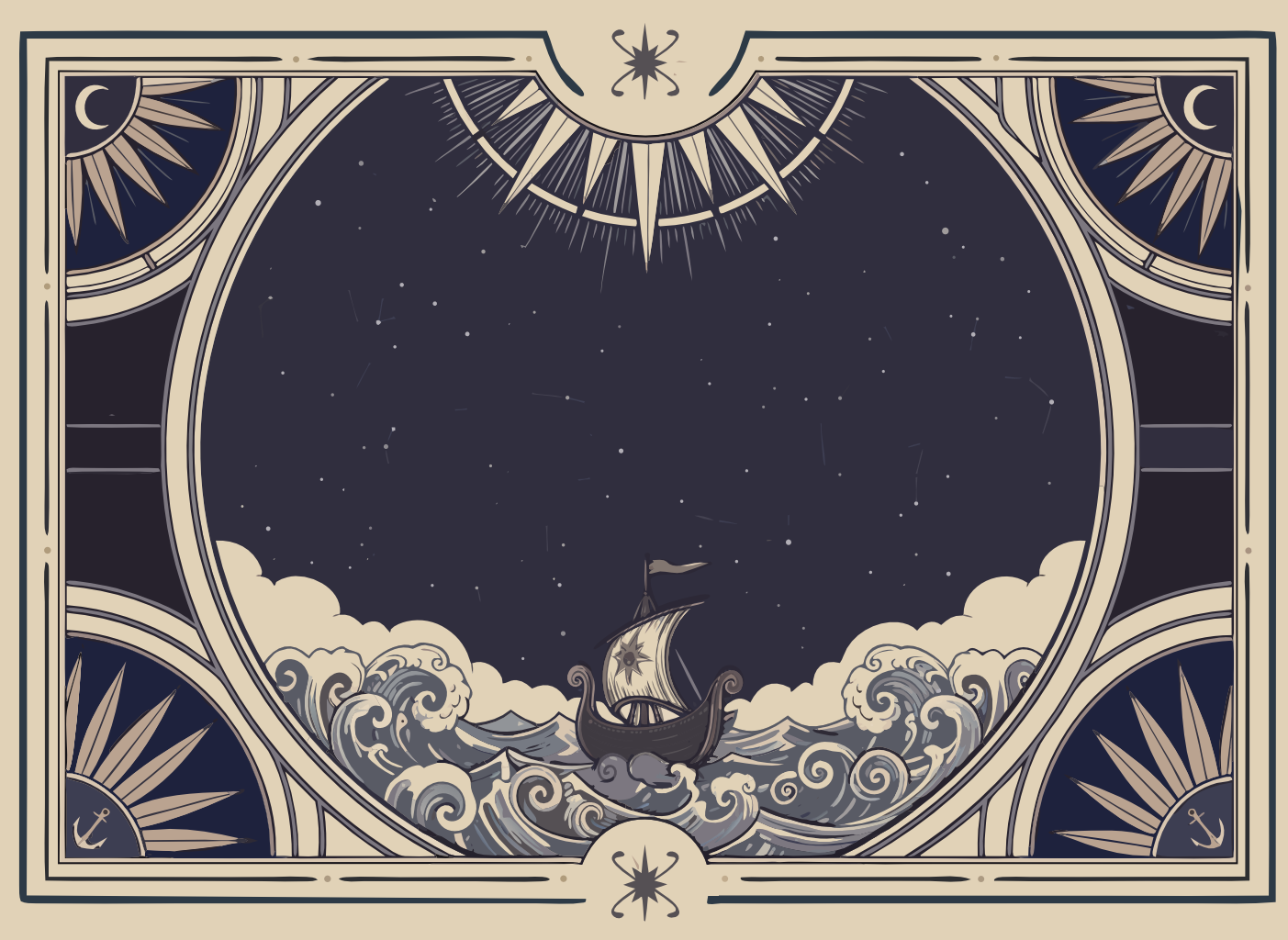
| 03 | Oracle muted | assets/oracle/ | Blog headers, newsletter heroes, editorial moments | Muted sailor-jerry flash. Navy + faded red/orange. Diamond frames. Playful where the inked set is reverent. |
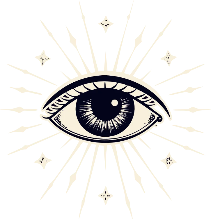
Register 01: Detailed inked · assets/elements/dark/
22 cream-on-navy hand-drawn WebPs. Can be used at partial opacity or full opacity depending on context. Dark-bg variants work universally across all three themes. Canonical uses: hero parallax (4 large + 2 bg), feature triad icons (Heart · Lighthouse · Sun at 100×100 / opacity 80), footer Ship at opacity 10%, ornamental corner frames at 25%.

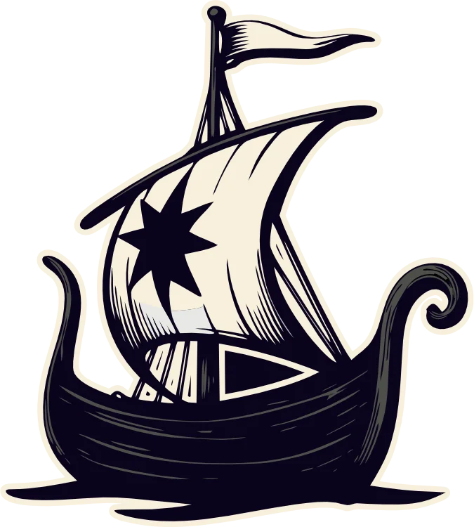


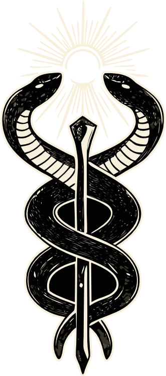
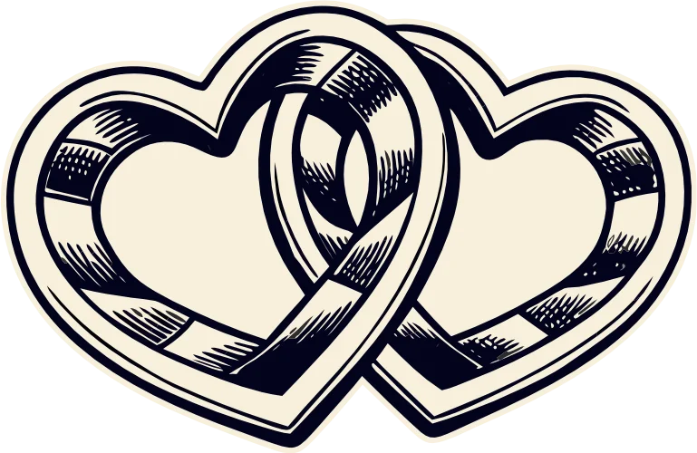

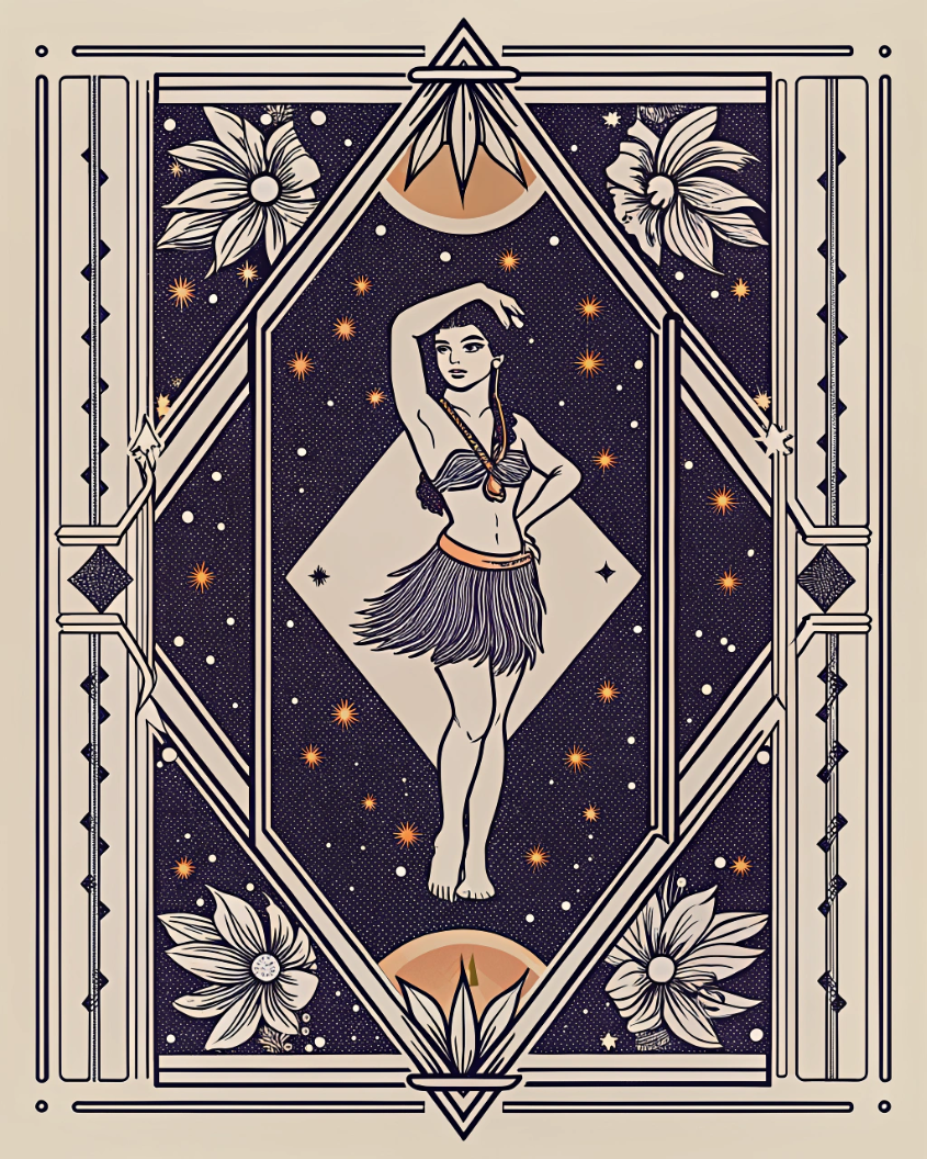
Register 02: Bold, billboard register (SB Card) · assets/board-art/
The art-nouveau illustration style that's the high-impact face of the brand: the art the Sailor sees inside their vision boards, and the art that ships on App Store screenshots, Pinterest pins, print, merch, and hero billboards. Heavy double keyline with botanical flourishes filling the four corners, or variants of the star-and-curl corner motif. Do not reduce opacity. Do not layer behind text. It is meant to be looked at.
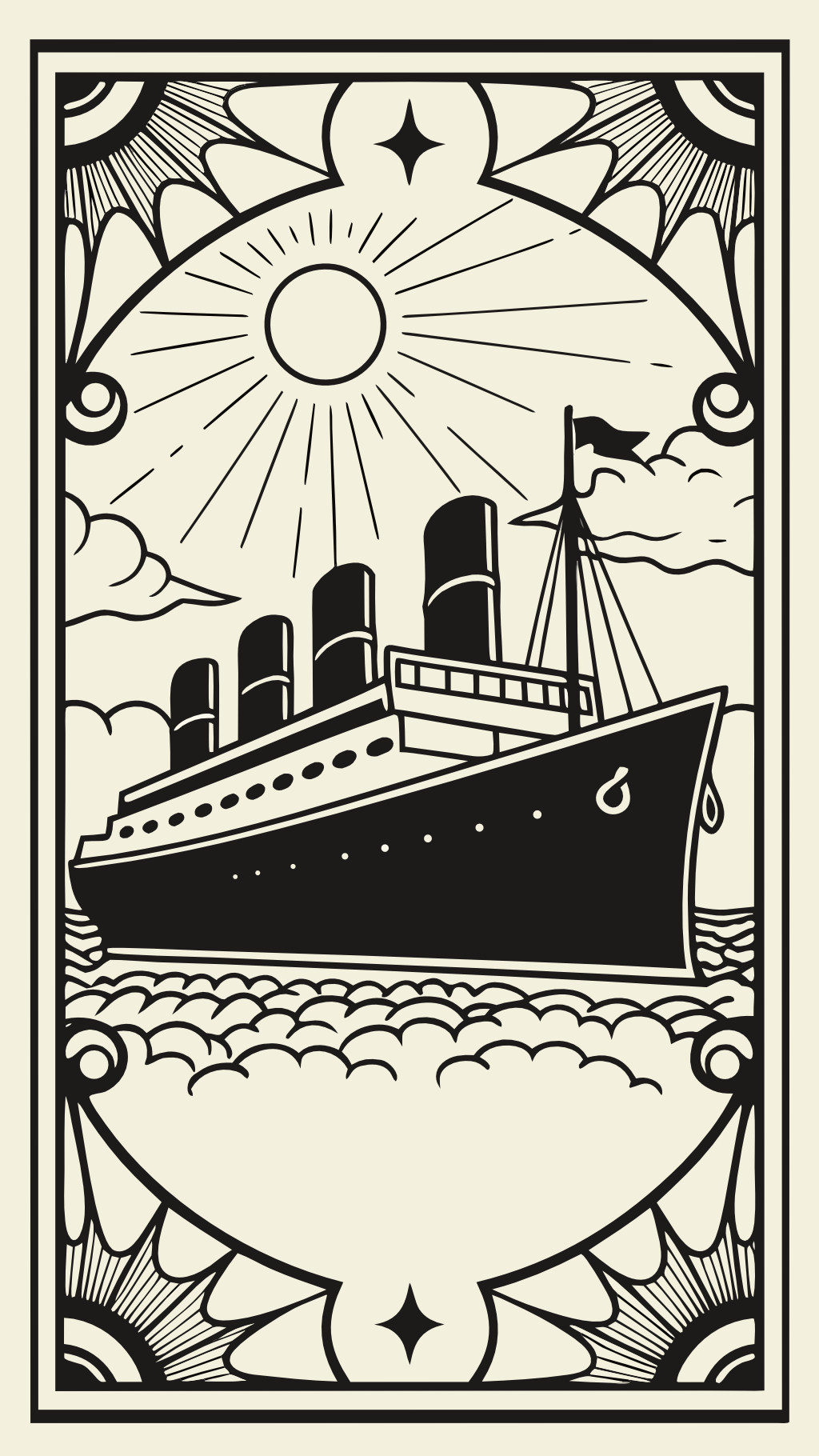
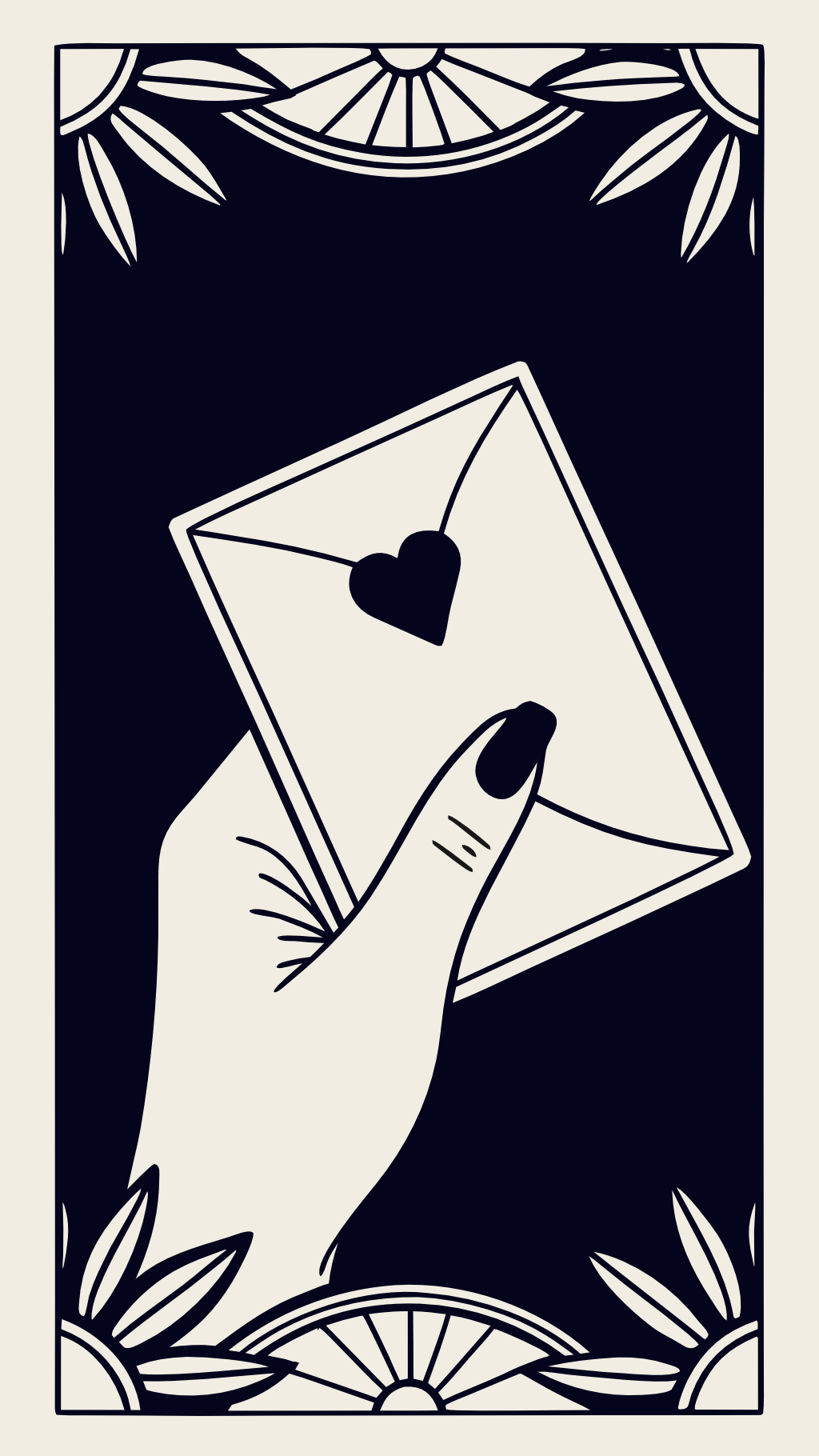
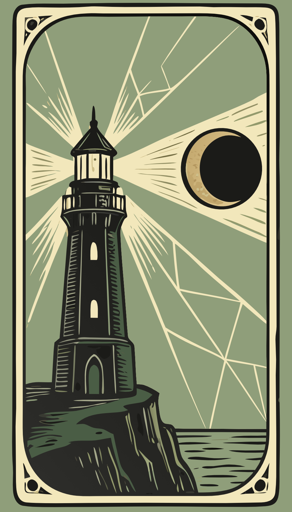

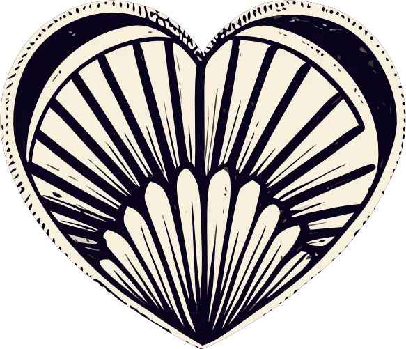
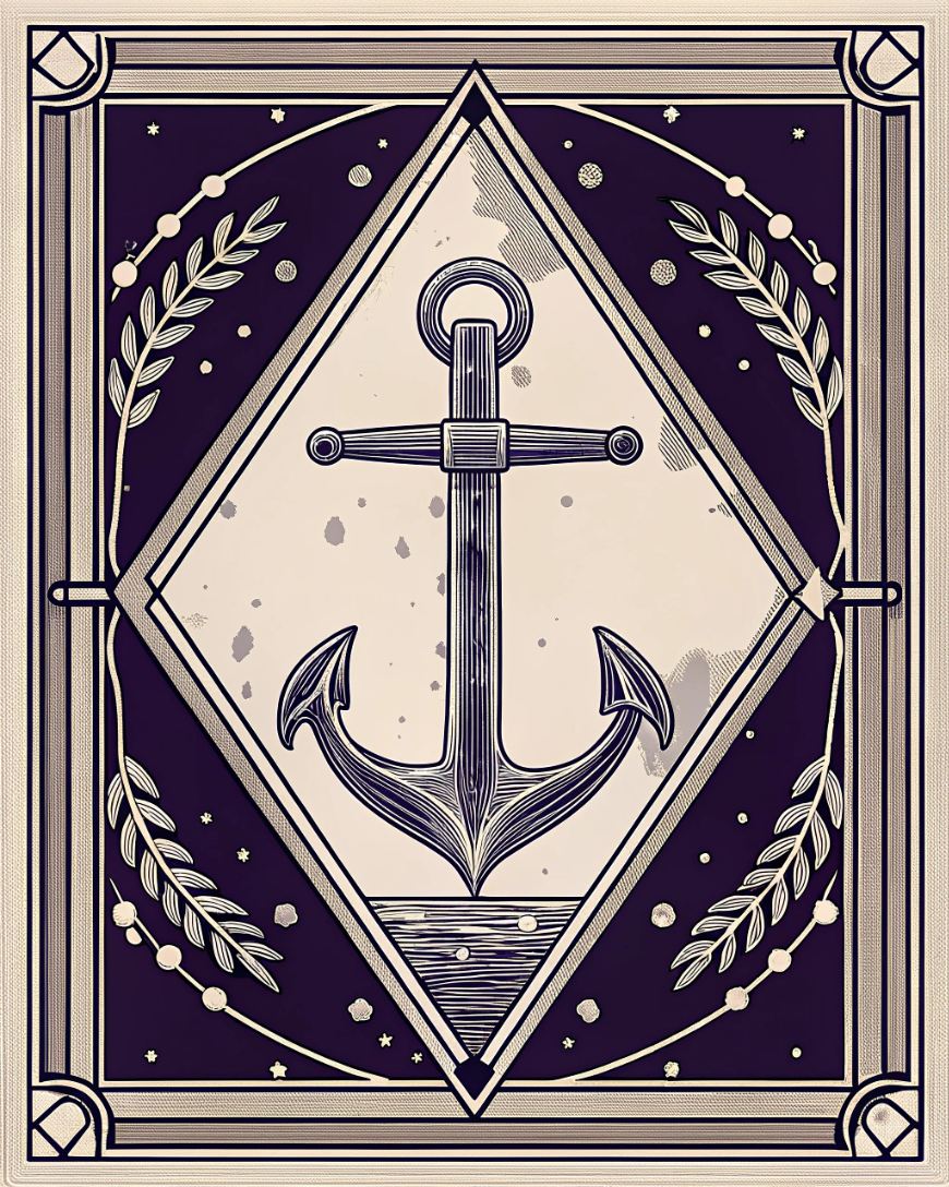
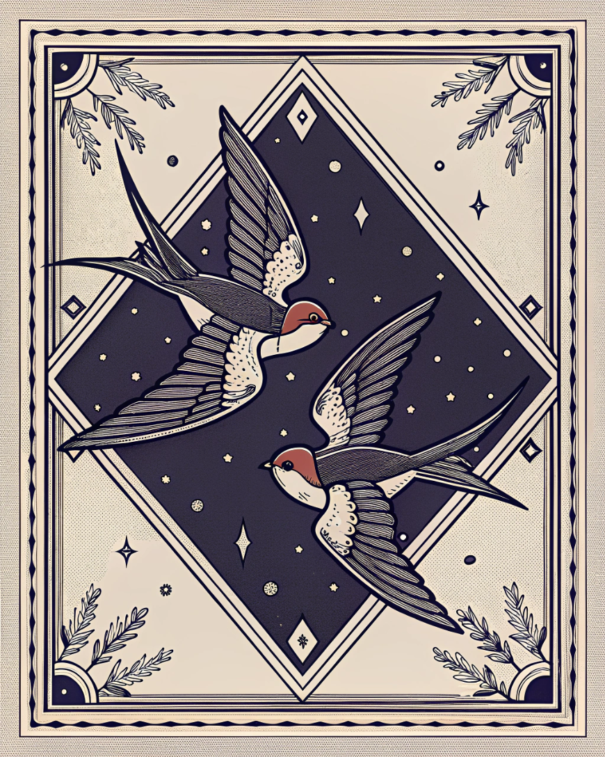
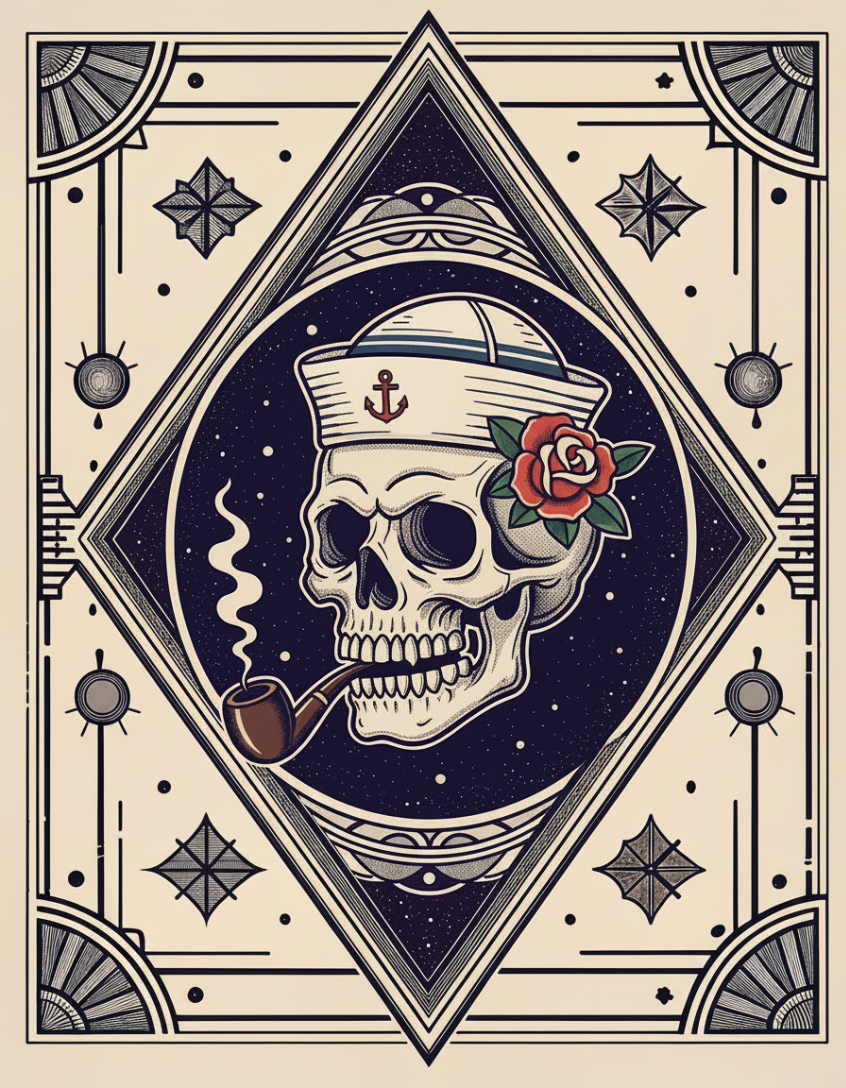
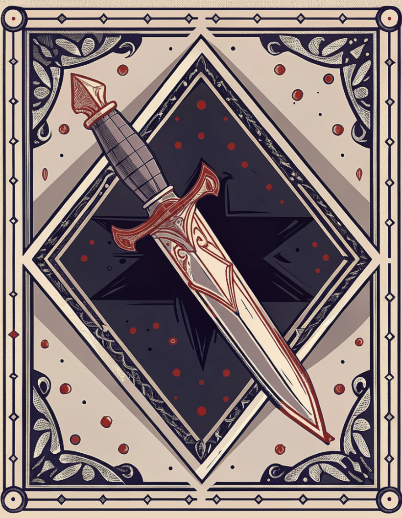
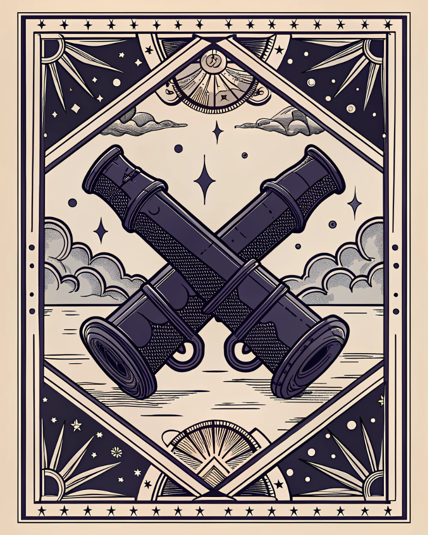
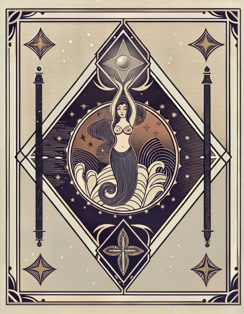
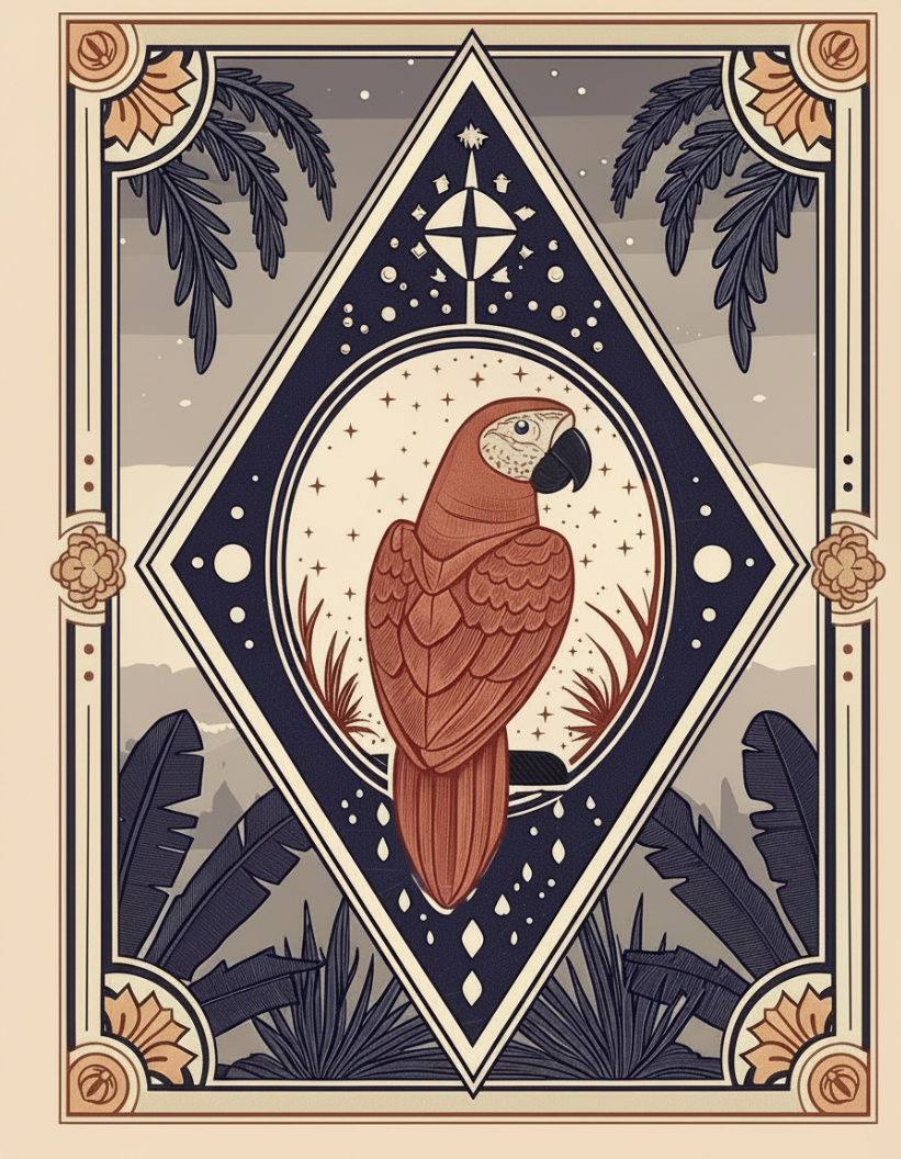
Register 03: Editorial register (SB IG Fancy) · assets/oracle/
Starboard's editorial register. The softer, slow-read illustration set for blog post headers, newsletter and hero banners that want literary weight. If Register 02 is the billboard, Oracle is the page you linger on. Corners and flanks carry ornament: fanned palmettes, flowers, seashells, stars. Bold outlines, flat fills, traditional flash shading. Muted, dusky palette. No bright primaries; the color is dialed back so the whole thing reads quiet and aged.
Oracle also includes oracle-flash.gif / .mp4 (assets/oracle/): a looping animated reveal used on the oracle draw moment in the app. Play as a one-shot, not a screensaver.
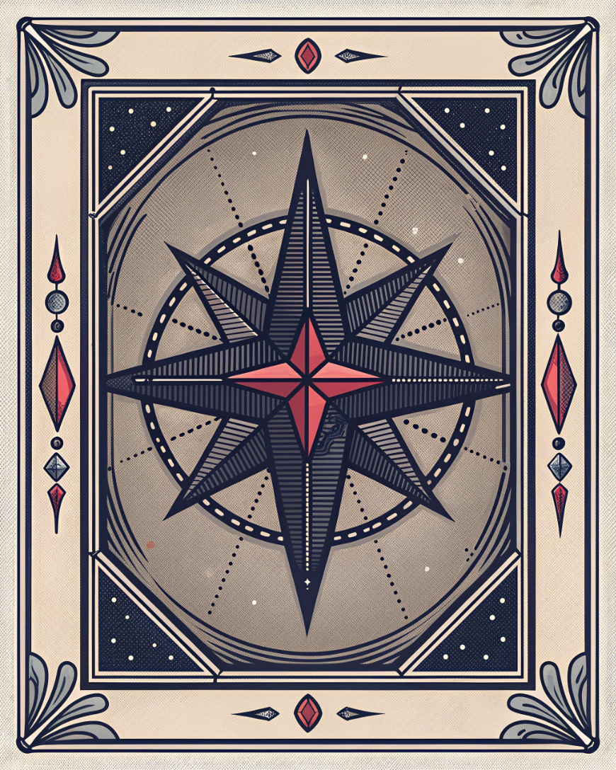
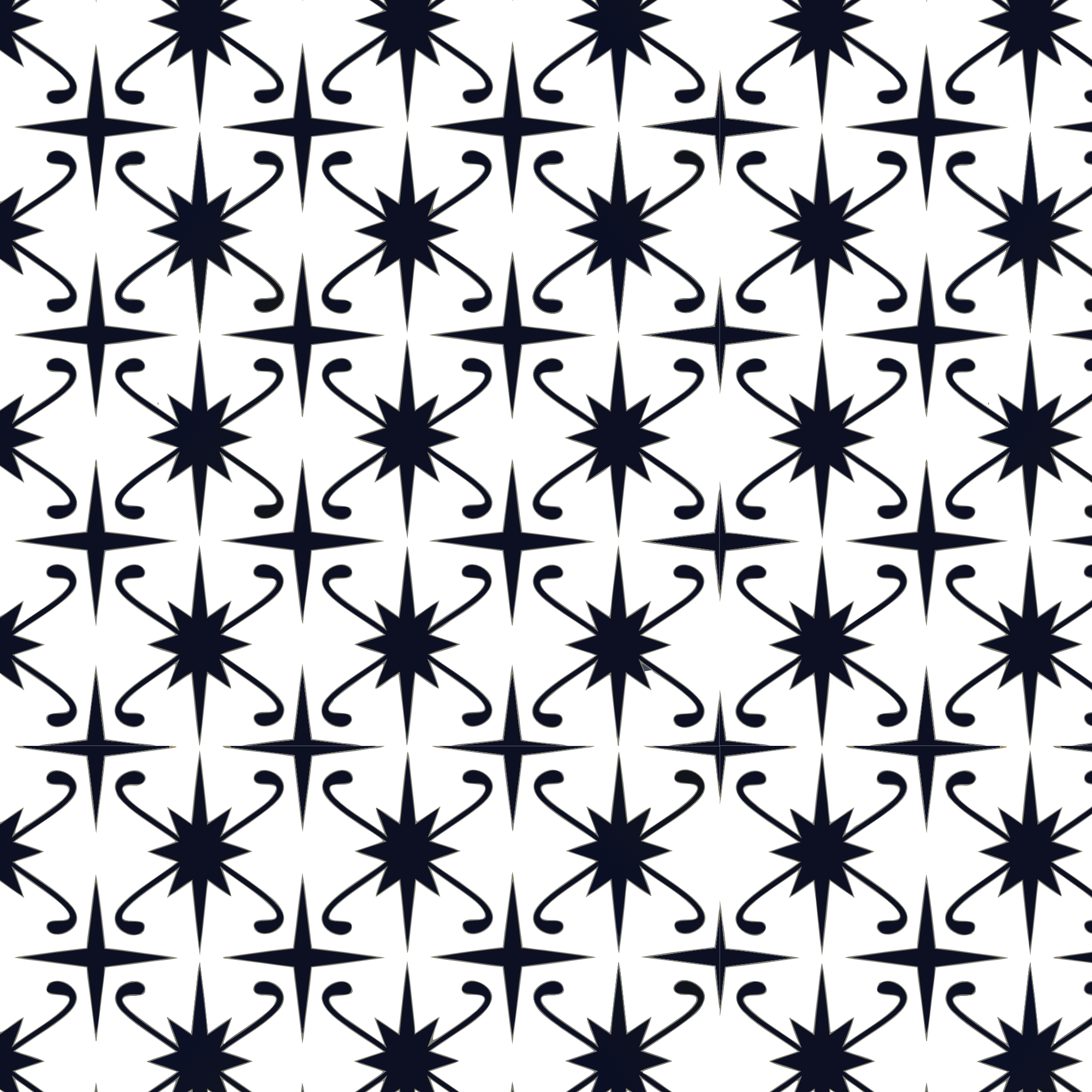
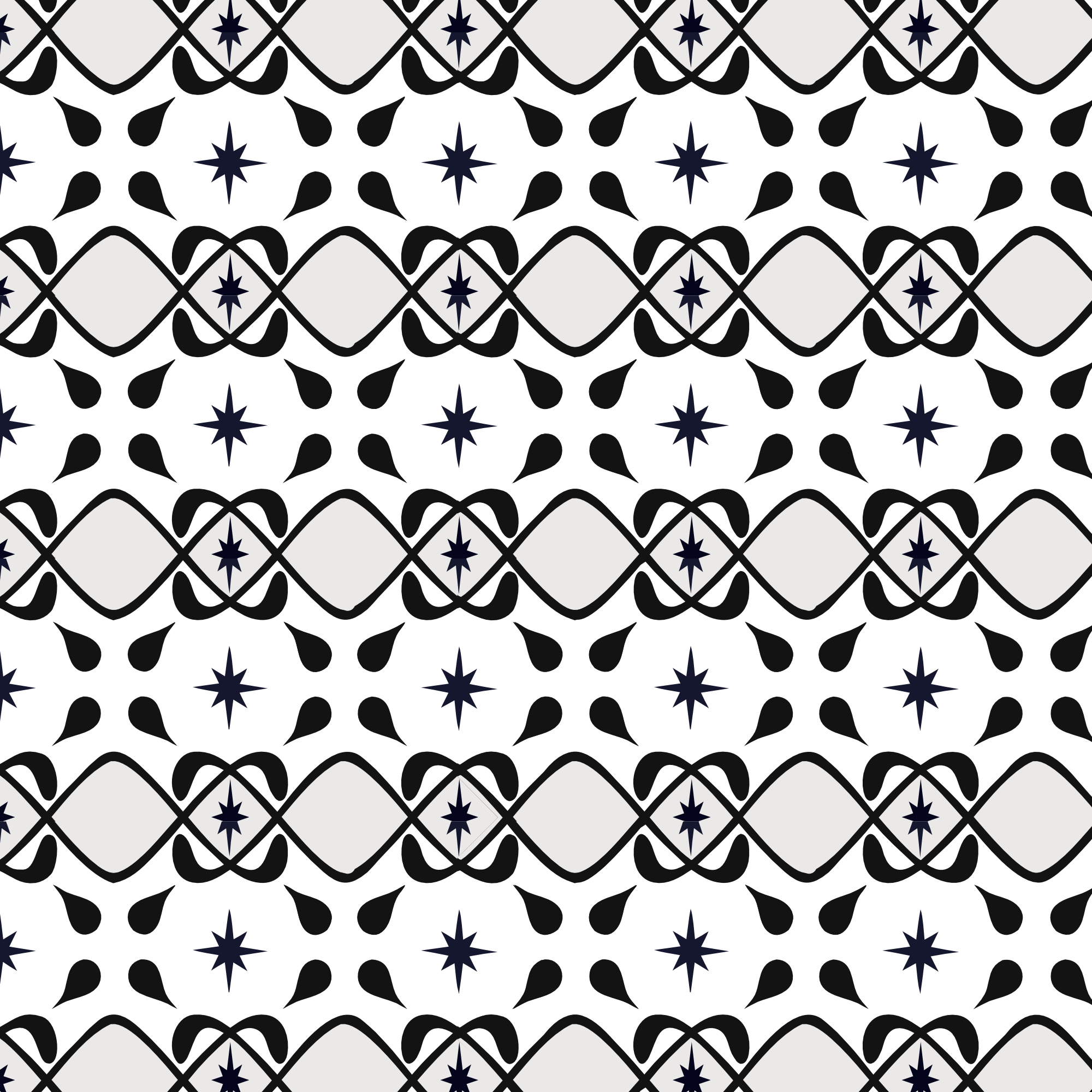
Frames, dividers, corner ornaments, and repeating star patterns. All live in assets/decorations/. Use frames as layout containers or art direction devices. Use dividers between content sections. Use star patterns as background texture at low opacity or cropped as surface fills.
Frames, brackets & divider


Backgrounds & star patterns
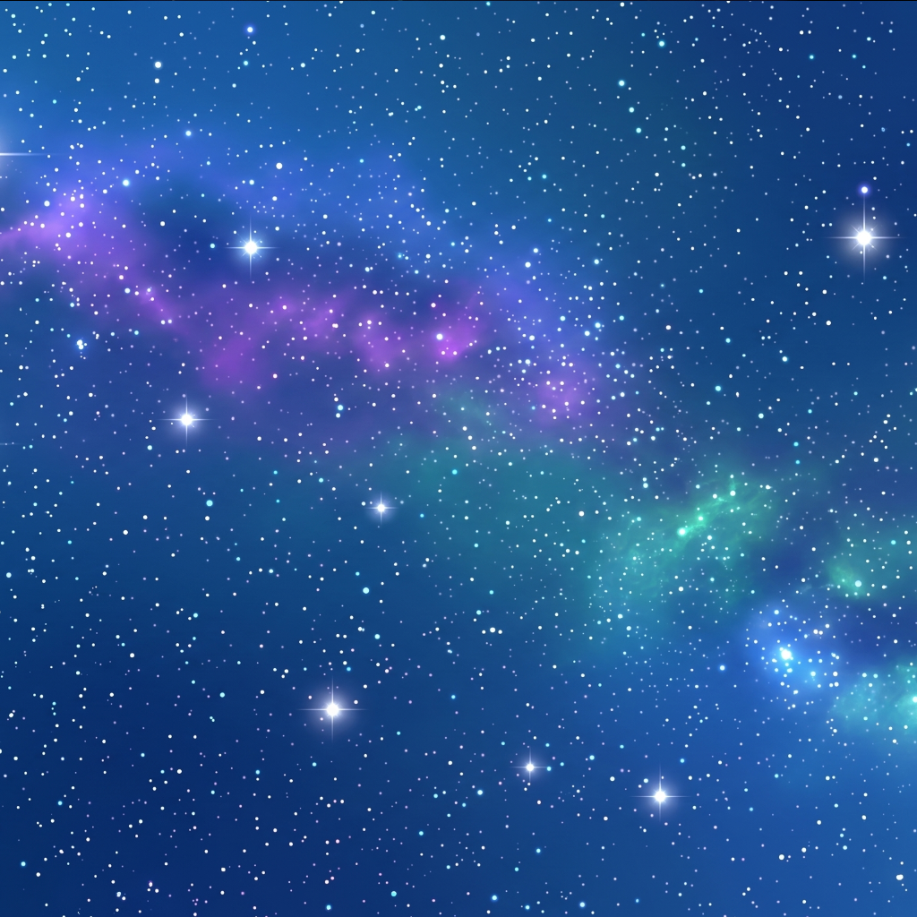
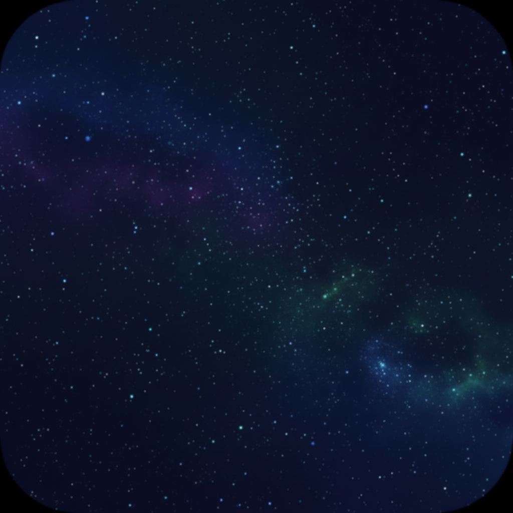
Repeating tile patterns for background fills and photographic star backgrounds. Use patterns at low opacity on dark surfaces or full opacity as bordered insets. The nebula is the photographic night-sky ground for heroes and slide title pages.

Interface chrome only: nav, buttons, status. Lucide React at stroke-width: 2 (1.5px in compact toolbars). CDN: unpkg.com/lucide@0.563.0. No emoji in customer-facing UI. Unicode → for inline link affordances. ASCII chevrons in selects, never the literal ▼.
Starboard is soft-cornered but not pill-heavy. Pill modifier reserved for segmented controls and dock.
Shadow values are tinted with the theme's text-color, not pure black. Cards lift on hover. Never use pure drop-shadow.
Container, gutters, and safe-area rules. All responsive. Values shown are md+ (≥ 768px). Safe-area variables are published as CSS custom properties for component consumption.
| Token / rule | Value | Usage |
|---|---|---|
| Container (marketing) | max-width: 64rem (1024px) | Hero, features, pricing, footer |
| Container (hero copy) | max-width: 56rem (896px) | Hero headline + subhead block |
| Section padding: vertical | py-12 → py-16 → py-20 | sm → md → lg breakpoints (48 / 64 / 80px) |
| Section padding: horizontal | px-4 → px-6 → px-8 | sm → md → lg (16 / 24 / 32px) |
| Card grid gutter | gap-6 → gap-8 | 24px default, 32px at md+ |
| Header height | 56px + safe-area-inset-top | Fixed top, --safe-top |
| Bottom nav height | 64px + safe-area-inset-bottom | Fixed bottom, mobile only, hidden at md+ |
--safe-top | env(safe-area-inset-top, 0px) | Components consuming header clearance |
--safe-bottom | env(safe-area-inset-bottom, 0px) | Components consuming bottom nav clearance |
--bottom-nav-height | calc(64px + var(--safe-bottom)) | Content padding to avoid bottom nav overlap |
The aged-parchment texture is the default page background in every theme. A fixed SVG fractal-noise layer overlaid on the theme bg-color. Atmospheric overlays (star tile patterns, particles, ink texture) are Moon page only, staying within the existing theme palette. No flat color replacements.
.bg-parchment-texture: SVG feTurbulence fractal noise, position: fixed; attachment: fixed. Opacity 4–8%. Covers the whole viewport so textures are consistent when scrolling.
Brand SVG/WebP elements always render at opacity 0.25–0.40 and float behind content. Never use as primary content. Dark-bg WebP variants work universally across all three themes.
4 large elements + 2 background elements placed absolutely around the hero, shifted by mouse position (±20–40px). CSS only for reduced-motion fallback, elements simply sit statically.
Marketing, onboarding, emails, and slides contain no photography. User-uploaded vision board photos are user data, not brand assets. Treat them as warm, sun-flared lifestyle imagery.
Full system: three easing curves, four animation families, stagger-on-entry. All transitions respect prefers-reduced-motion: reduce. Kill when set.
--ease-out-expo--ease-in-out-sineStarboard is written by Megan Williams, founder and captain. The audience is the Sailor. One nautical term per surface, not three. The blog at starboardmanifest.com/blog is the running tone-of-voice reference.
Voice persona
| Name | Role | Sign-off |
|---|---|---|
| Megan | Personal voice: blog posts, founder letters, long-form writing | — Megan |
| The Captain | Product voice: welcome emails, app onboarding, push notifications, marketing sign-offs | — The Captain |
| Megan, Captain | When personal and product voice both apply | — Megan, Captain |
| Sailor | The audience. Capitalized when addressed directly. Open or close of long-form. Drop in chrome and button labels. Never "the user". | Welcome aboard, Sailor. |
We are · We are not
| We are | We are not |
|---|---|
| Steady authority: we guide, we don't hype | Hyped, motivational-poster energy |
| Long-range thinking: charting courses, not chasing trends | Trend-chasing, reactive |
| Grounded confidence: precision over performance | Goddess, divine feminine, vibration |
| Mythic intelligence: older than wellness, Victorian navigational | Abundance mindset, universe provides |
| Explorer, not priestess: universal, inclusive, not gendered or goddess-coded | Wish-making, magic, manifesting |
| Dry honesty: first person, willing to admit what is and isn't working | Spiritual bypassing, toxic positivity |
Brand vocabulary
Brand-distinct terms Starboard owns. Brand voice first in the chrome. Search-friendly vocabulary (mood board, dream board, manifestation, meditation) belongs in supporting copy, metadata, and SEO descriptions.
| Term | When to use |
|---|---|
| Sailor | The audience. Capitalized when addressed: Welcome aboard, Sailor. |
| the Captain | The voice: sign-offs, push notifications, formal product speech |
| Megan | The personal voice: blog sign-offs and founder letters |
| vision board | Core noun, every surface |
| board | Shorthand inside the app once a vision board is open |
| montage | The looping video output |
| affirmation | The written intention attached to a reminder |
| reminder | Scheduled push or local notification |
| lanthorn | Central metaphor for the practice. Long-form only, not chrome. |
| chart · course · bearings | Navigation verbs for goals, intent, direction |
| constellation · north star · horizon | Celestial direction language |
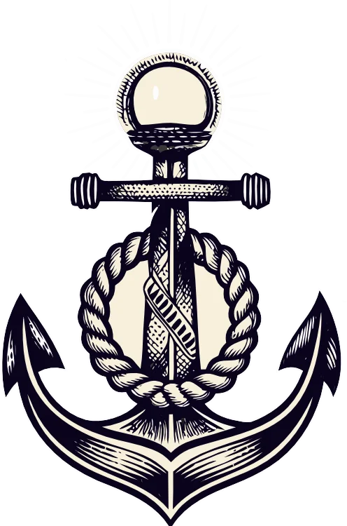
| anchor · helm · compass · sextant | Grounding and instrument metaphors |
| tide · current · voyage · landfall | Passage metaphors for progress over time |
| healing frequency | The Solfeggio audio (396, 432, 528 Hz, etc.) |
Nautical vocabulary palette
A resource pool. Reach for a term whenever it lands naturally. Restraint matters: one nautical term per surface, not three.
Punctuation & style
| Rule | Example |
|---|---|
| No exclamation points | |
| Commas and short sentences over em dashes. Em dashes feel editorial. Use commas, fragments, and the occasional colon-led tangent instead. | It had to be tended. That's Starboard. |
| Sentence case everywhere; Title Case for chrome page titles | Vision Boards · Library · Moon Phases |
| UPPERCASE wide-tracked for eyebrows, labels, badges | PLANS · ONBOARDING · 60% |
| Numbers in copy: numerals | 3 vision boards · 13 daily reminders |
| Pricing: localized | £23/year · £72 one-time |
Surface copy
| Surface | Copy |
|---|---|
| Tagline | Your vision, on board. Your course, in sight. |
| CTA headline | Set Your Course |
| Marketing headlines | Set your course. · Steady as she goes. · Even keel. |
| Onboarding steps | Cast off · Get underway · Set bearings · Make fast |
| Success state | Anchors aweigh. Your board is saved. |
| Error state | Dead in the water. Try again. |
| Empty state | Your library is high and dry. Add an image to begin. |
| Push notification | Fair winds, Sailor. Time to revisit your board. |
| Email subject lines | Letters from the Helm · The doldrums are temporary · Following seas this week |
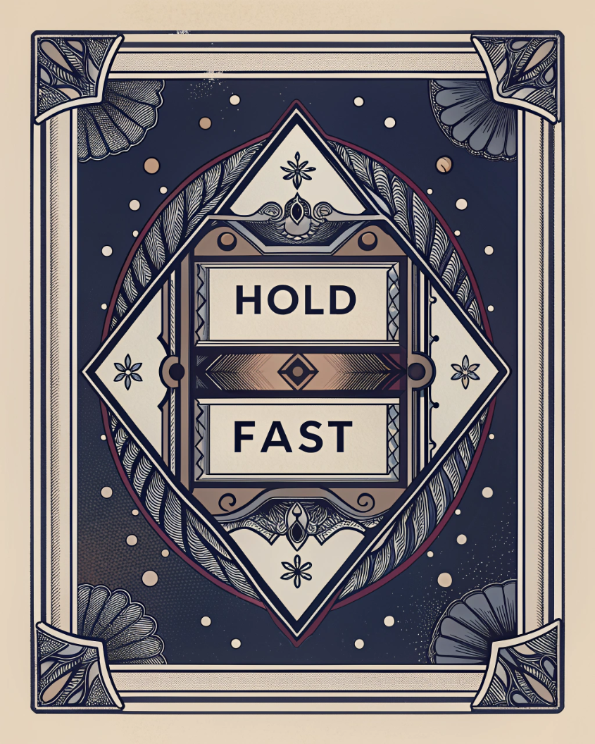
| Slogan / merch | Hold fast. · Steady on. · Sea legs. · Even keel. |
| Email sign-off (personal) | Welcome aboard, Sailor. — Megan |
| Email sign-off (product) | Fair winds. — The Captain |
Steeped in lore: long-form writing
Blog, newsletter, social, and Instagram are edutainment. Every piece leaves the Sailor feeling enriched. A single surprising fact, told plainly, that opens into a wider story. No Such Thing as a Fish cadence: here is something interesting, and here is why it matters.
Etymology of lanthorn. Why ships are called she. The origin of starboard, port, posh, the bitter end. Naval superstitions: no whistling on deck, never sail on a Friday.
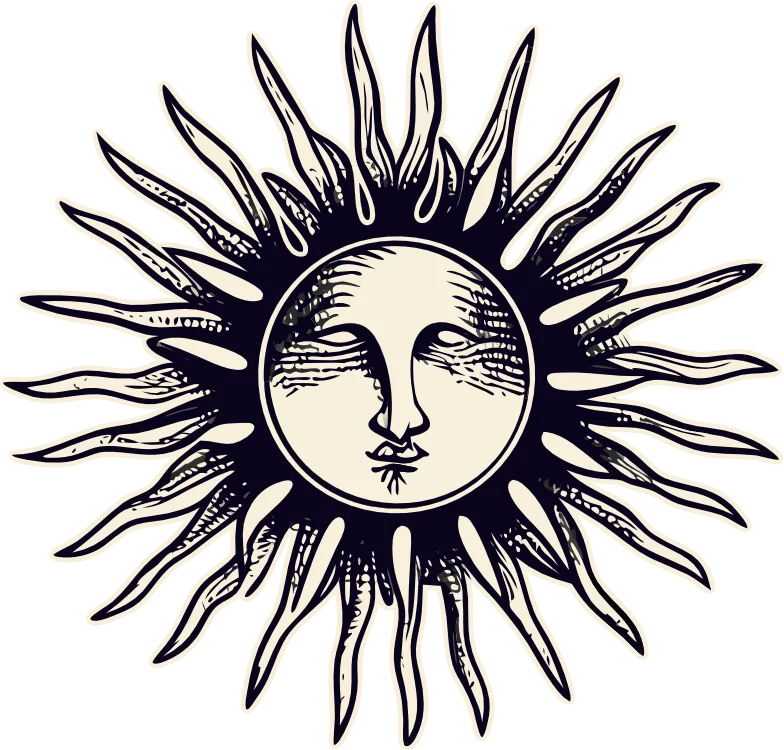
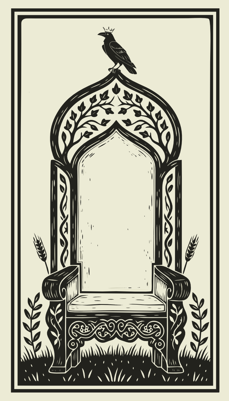
Sea gods: Poseidon, Manannán mac Lir, the kelpie. Constellations and navigation (Cassiopeia, Orion's belt). Norse navigational mythology. Selkies. The Morrigan as crow.
Reticular activating system and why repetition rewires attention. Lunar tidal physics. Neuroplasticity and behaviour change. Celestial navigation: sextant geometry, why the North Star sits where it does.
Why the Strawberry Moon is named for a narrow harvest window. Full moon folklore. Solstices, equinoxes, cross-quarter days as markers for practice.
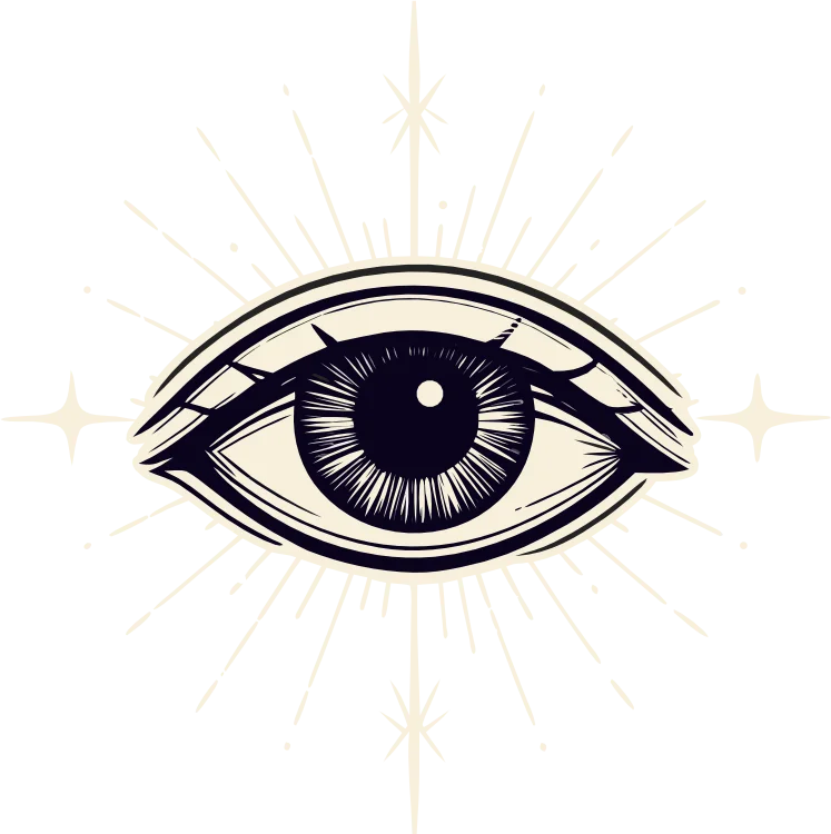
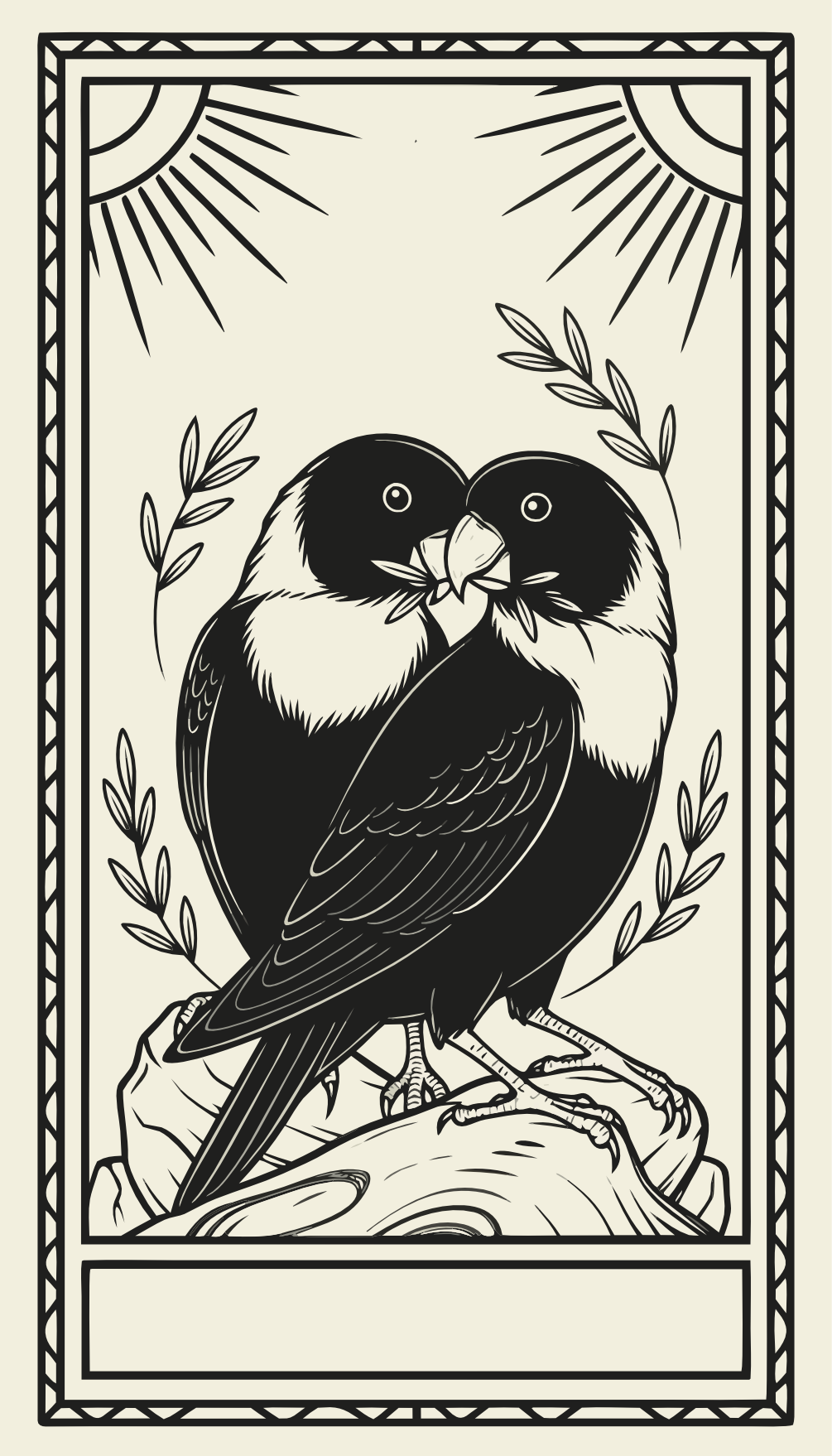
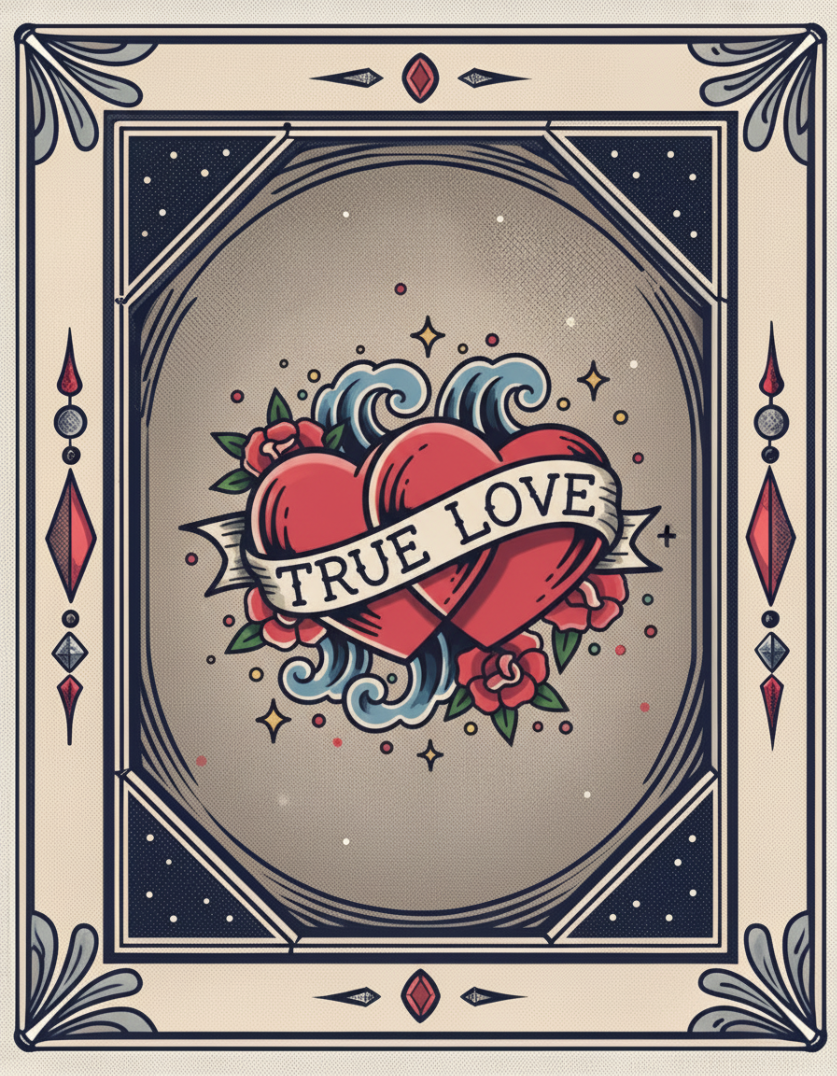
Tarot iconography. Oracle decks. Sailor-jerry tattoo meanings: swallows = home safely, anchor = grounded, hold fast = endurance. Victorian navigational charts, monk illumination.
Six formats: Instagram square (quote, lore, affirmation, board of the month), Pinterest portrait, and Instagram story. All use brand backgrounds, Playfair italic headings, and Chivo UI text. Suggested copy sits below each tile.
Big Playfair italic quote on a textured ground. Captain or Megan signature in the corner. Use for affirmations, brand lines, and blog pull quotes.


Single surprising fact. The No Such Thing as a Fish register. Edutainment, never a lecture. Maritime, mythology, science, botanical, and folk practice.
DID YOU KNOW
Sailors called them lanthorns. Letting one go out at night was a harbinger of doom.
DID YOU KNOW
The brief window when wild strawberries ripen. Pay attention or miss them entirely.
DID YOU KNOW
Tell it what to care about, and it will find that thing everywhere. This is what a vision board does.
Short statements, big type, deep ground. Save-and-share content. Designed to be screenshotted and used as a phone wallpaper.

Featured monthly board using a vision-board art illustration. Caption gives the lunar context and the prompt for the Sailor's own board.
Tall format, scroll-stopping numerals, lore-led. The medium where edutainment travels furthest. Designed to be saved to boards, not just liked.
Number of full moons each year, in the Western system.
Which is why a 13th, when it happens, gets a name of its own. Blue moon.
Sailor-jerry tattoo lore.
5,000 nautical miles earned a sailor their first swallow. Two birds meant 10,000 and a way back.
A practice list from the Captain. Read the full post.
starboardmanifest.com/blog
Sailors carried a flame they were never allowed to let go out. We carry the same thing, just digital.
starboardmanifest.com/blog
Vertical, scrollable. Three jobs: announce a new full-moon board, share an affirmation, and prompt a link tap to the blog.